When it comes to creating accessible and reader-friendly documents, font selection plays a crucial role, particularly for individuals with dyslexia. Dyslexia is a learning difference that can affect reading, spelling, and writing abilities. Choosing the right fonts can significantly enhance readability and improve the overall reading experience for individuals with dyslexia. In this article, we'll explore the top 5 dyslexia-friendly Google Docs fonts that can make your documents more inclusive and accessible.
1. Comic Neue
Comic Neue is more than just its playful appearance; it is a font designed with readability in mind. While it maintains an informal and approachable style, Comic Neue incorporates irregular shapes and distinct characters that can prevent letter confusion, a common challenge for individuals with dyslexia. This font's unique design contributes to a more comfortable reading experience, especially for those who struggle with traditional typefaces.

2. Lexend
Lexend is a font family that takes a scientific approach to enhancing readability. It dynamically adjusts character spacing and size based on the text, optimizing reading speed and accuracy. With different styles available, such as Lexend Deca, Lexend Exa, and Lexend Mega, you can choose the variant that best suits your audience's preferences. This font's adaptive design can be particularly beneficial for dyslexic readers, aiding their ability to absorb and understand written content.
3. Montserrat
Montserrat is a clean and modern sans-serif font that offers excellent legibility for a wide range of readers, including those with dyslexia. Its simplicity and straightforward design make it easy on the eyes, minimizing distractions that might hinder reading. Montserrat's uniform character shapes and clear letterforms contribute to a smooth reading experience, making it a reliable choice for creating accessible documents.

4. Roboto
Roboto is a versatile sans-serif font that strikes a balance between modern aesthetics and readability. With its open letterforms and well-defined characters, Roboto ensures that each letter is easily distinguishable, which is vital for dyslexic readers. Its clean and straightforward design can make reading less strenuous and more enjoyable, particularly for longer texts.
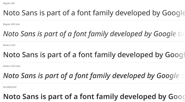
5. Noto Sans
Noto Sans is part of a font family developed by Google to ensure consistency across various languages and platforms. Its design focuses on clarity and legibility, making it a suitable choice for documents targeting a diverse audience, including individuals with dyslexia. Noto Sans' balanced proportions and clear distinctions between characters contribute to a more accessible reading experience.
Incorporating dyslexia-friendly fonts into your Google Docs not only benefits individuals with dyslexia but also enhances the overall readability of your content. When choosing a font, consider your audience, the context of your document, and the specific needs of dyslexic readers. Additionally, pay attention to factors like font size, line spacing, and contrast to create documents that are truly inclusive and welcoming to all readers. By prioritizing accessibility in your font selection, you're taking a meaningful step toward making your content more equitable and user-friendly.